Designing Dining Rooms
Culture, environment and expectation are key to successful dining room designs.
Knowing expectations is the most important component to good dining room design, according to David Porter, CEO and president of Porter Khouw Consulting. Porter says it’s important to determine how the dining room space is going to be used. “If you’ve got summer camps, catering or other large functions, you need to be able to convert the dining space,” he says. In this case, Porter says to steer clear of any permanent fixtures, including raised platforms or chairs and tables affixed to the floors.
After deciding how the space will be used, Porter says to create different environments within the dining room by breaking up sections with different seating options, colors, décor and lighting to break the monotony for frequent diners.
Bob Rippe, principal with Robert Rippe Associates Inc., says that a good dining room design incorporates the customers’ behaviors. “I think the biggest mistake is people don’t think about the customers’ culture,” Rippe says. “By culture, I mean seating patterns. In a little hospital, everybody knows everybody and lunch becomes a social event, so you have a greater percentage of larger groups. At a large hospital, you get an awful lot of people who sit one or two people to a table.”
Rippe adds that during the past 15 years, dining room size has decreased while servery size has increased. He says this is because more food preparation has moved to the front of the house and because customers either take food back to their desks or they have a limited time to eat lunch.
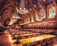
Harvard University, Annenberg Hall “You want to create an experience, whether it’s through pictures, symbols or architecture,” Porter says. “It communicates the spirit of the school and it helps create that emotional brand and connection, especially if you are a first-year student.” This concept is at work at Annenberg Hall, Harvard’s freshman dining hall. Ted Mayer, executive director of dining services, likens Annenberg Hall to something out of a “Harry Potter” movie. The dining room has a 35-foot vaulted ceiling and stained glass windows surround the students in a dining room that exudes all of the tradition and grandeur of the country’s oldest university. Because the dining halls are central to campus activity, Mayer says students will often use the dining spaces for activities besides eating. |  |
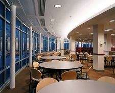
University of Iowa, Burge Hall “We had a dining room setup that was divided with the servery in the center and a dining room on the north side and the south side,” says Greg Black, director of residential dining. “When we redid Burge in early 2005, we wanted |  |
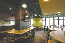
University of North Dakota, Squires Hall When Orlynn Rosaasen, director of dining services, renovated Squires Hall, he wanted to bring the space out of the ‘70s and into the 21st century. “We wanted to deinstitutionalize the dining room,” he says. “We had all six-foot long tables. There was orange carpet and ugly wallpaper.” From seventies drab, the space was transformed to an environment similar to one found at a casual dining restaurant. “We wanted a fun environment. We did that not only with the different seating—booths, high-top tables, etc.—but also with the color scheme and lighting. There is nothing bland about the color scheme and there are at least five different types of lighting.” Rosaasen says one of the best design features is the ceiling, which varies in height, color and lighting. |  |
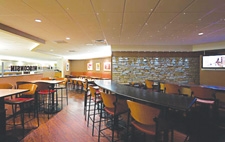
University of Wisconsin Hospitals and Clinics In late 2005, Foodservice Director John Hoffman renovated the hospital’s dining room to create separate dining environments. “We wanted to avoid one big room with long tables, so we created smaller, more intimate dining areas,” Hoffman says. “We didn’t want people to feel as if they were eating in an old college dining hall with 200 tables and an open space.” One of these dining areas is the Badger Den, named after the University’s mascot. Hoffman says what sets the Badger Den apart from other dining areas is the bar-like atmosphere. There are high tables for four and individual seating at longer high tables. A flat-screen TV and a rock wall also help to differentiate the area. |  |
About the Author
You May Also Like


.jpg?width=300&auto=webp&quality=80&disable=upscale)

